Call to action, also known as “CTA”, is applicable to web pages, advertisements, or pieces of content which encourage their audience to do something. In marketing, copy is written with a CTA to help a business convert visitors or readers into a lead for the sales team. The call to action should take the viewer to the next step down the funnel. CTAs are often presented in a designed format, using buttons and larger graphics for the audience to interact with; click, press, or subscribe, are all calls to action.
Below are a few examples of the types of CTAs you might use:
Sign Up
With this type of CTA, the audience is invited to sign up – for a free trial, an online course, a future event, some free content, or even a software product. It all depends on the CTA’s context on an ad or website.
Subscribe
This CTA doesn’t commit a person to a purchase, but it invites them to receive updates so they will continue to interact with the site or content in the future, and potentially become a customer down the road. “Subscribe” CTAs are common on blogs and other content sites.
Try For Free
Nearly every company website has a free trial offer. These are the most common CTA of this variety, as they allow people to experience a product before deciding if it’s worth the investment.
Get Started
This CTA can drive the viewer to make a purchase, start a course, or try a product/service.
Learn More
Sometimes, all you need to do is to give your potential customers a little more information so they’re prepared to buy something.
Join Us
Do you manage an online community? Is your product built on collaboration between users? Even if it isn’t, you may find yourself placing “join us” CTA somewhere on your website to encourage a tribal feel to your call to action.
CTA (Call To Action) Form
A call to action can be delivered in different forms:
- Text hyperlink
- Button
- Plain text with no link
“Buy Now” or “Download Now” are typical examples. But a CTA can run longer and be more descriptive, such as, “Subscribe today so you’ll never miss a post.”
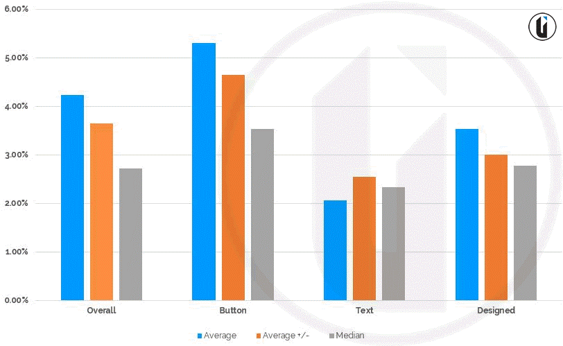
The average CTR (click-through rate) for a call-to-action element is 4.23 percent across all industries. Here is a breakdown of the overall averages, minus top & bottom (+/-), and average median click-through rates.
Breaking CTAs down by type, we see the following:
- Button: 5.31 percent average click-through
- Text: 2.06 percent average click-through
- Designed: 3.53 percent average click-through

Statistic source: ©Vye
Use a Strong Command Verb to Start Your CTA
It’s all about being clear and concise with your CTA. You don’t have a lot of space in your ad to get your point across, as character limits are set at 35 characters per line, so it’s important to get straight to the point. Let your audience know exactly what you want them to do – start the CTA with the desired action.
- If you run an e-commerce website, start your CTA with words like “buy,” “shop,” or “order”
- If you’re promoting a newsletter or white paper then start your CTA with words like “download” or “subscribe”
- When you want your viewer to request more information, try “fill out a form for…” or “find out how…”
If your CTA doesn’t tell them what to do, or uses weak language like “Our latest program is available”, you may not get a great click-through rate because visitors might not be sure what they are supposed to do. Instead, use “Download our 7 day program”, which is much more direct and to the point. This will help improve your CTR.
Use Words That Provoke Emotion or Enthusiasm
Get your audience excited by being enthusiastic. “Buy now and get 50% off!” creates both value and urgency. Not only are you providing them with a massive benefit, they will be thrilled to get their order for half off.
Get a Little Creative
Keep your CTAs fresh, much like you do with your ad copy in general. A good old-fashioned A/B test is a great way to identify which CTAs bring you clicks, and which CTAs bring you frowns. While your tried and true calls-to-action like the ones we’ve already discussed are always good to use, you really never know how they’ll perform in your account until you actually use them.
Remember: One page – One CTA
“One page, one purpose” is the golden rule of copy.
If you want people to sign up for a newsletter, that’s the only CTA the page should have.
If you want your audience to purchase a product, that’s the only CTA that should be on that product page. Never complicate matters or confuse your users with multiple CTAs. When faced with too many options, people will get overwhelmed and avoid making any choice.
The best way to find out what calls to action are strongest and work best for you is to experiment. Get to work and try different tactics as outlined here. Have fun with it, and your business will prosper!
Subscribe for more business, sales, and investing posts. Have a lovely day.


