Elementor is one of the most widespread and popular page builder plugins for WordPress. Whether you want to create a blog or set up an online store, Elementor is the right choice for building your pages. To help WordPress users optimize in a market where more than half of all internet traffic is accessing sites via mobile devices, Elementor makes your website’s adaptation to a mobile-friendly format seamless. Edit, drag and drop, element arrangement, and other features are organized in a way that can be individually adjusted for both mobile and browser viewing.
* We receive commission on purchases made through links on this page.
Page builders are plugins in WordPress that allow you to create your website just the way you want by simply dragging and dropping elements into place. Once you get used to working with Elementor and its easy-to-use widgets, you won’t need any other page builder. We’ve put together some simple tips to help you start building your WordPress website with Elementor.
Introduction To Elementor and Its Features
Elementor has become one of the essential plugins for WordPress and is certainly one of the best page builders on the platform. What sets Elementor apart from older-generation page builders is its complete user-friendliness. With Elementor, you can literally drag elements onto your site, and changes become immediately visible once your site is online. It’s also possible to create an entire website without typing a single line of code. Elementor is fully responsive, meaning you can always set your site to look different in tablet or mobile mode for better visibility and aesthetics, which is key in today’s online world.
Tailored Display for Mobile Devices
Today, over 60% of internet traffic comes from mobile devices, and this number continues to grow. It has become a standard practice for websites to adapt their format for mobile phone and tablet viewing. With Elementor, this adaptation can be even more advanced. If there is a need to show a specific site element exclusively on a computer and not on a mobile phone or tablet, configuring this customization with Elementor is straightforward. Text size, element arrangement, feature display—everything is organized so that it can be individually adjusted for each type of device.
Using Ready-Made Themes: Custom Design and Site Functionality for Different Devices
Elementor offers limitless possibilities in website design. It’s not just an ordinary “page builder.” With Elementor, you can design all the specific elements of a website, including the header, footer, menus, pop-ups, and anything else you can imagine. Each page can be individually designed, and the use of color palettes and fonts are not limited to the entire site theme. Get creative and customize each section exactly the way you want it to be.
Easier Tracking of Trends and Updates
Trends on the internet and the appearance of websites are in a constant state of flux. Similarly, companies evolve and change the way their websites are presented. Elementor allows for easy tracking of current trends and updates in web design. The platform facilitates rapid and straightforward modifications to your site, ensuring that it stays up-to-date with the latest design and functionality trends.
This flexibility is crucial for keeping your website relevant and engaging for visitors. Whether it’s adjusting the layout, incorporating new design elements, or adopting the latest web technologies, Elementor simplifies the process of making your site dynamic and responsive to industry changes. With Elementor, any potential change is quickly achievable without the need to overhaul the entire site or create a new one, saving you time and money.
Quick and Simple Modifications
With Elementor, it is much easier to create a site tailored to you or your client’s needs because every business is unique, and adapting a ready-made design, as seen in pre-built themes, can be challenging.
Whether it’s a change in colors, adding new features, altering icons or fonts, or even a complete restructuring of the site, Elementor makes every change feasible. It’s common for companies to create entirely new websites because their current ones are considered “outdated” and don’t align with current trends or their new branding. Elementor allows for periodic “refreshing” of the website design without disrupting the technical setup or requiring significant changes in the site’s structure or content.
Elementor is ideal for digital marketing because it simplifies the process of creating landing pages and pop-up windows, making it the perfect tool for digital marketing efforts. Whether you need a specific landing page for a campaign or want to implement attention-grabbing pop-ups, Elementor’s user-friendly interface and extensive features make these tasks easily achievable. This flexibility and efficiency make Elementor a valuable asset for companies aiming to stay current with digital marketing strategies and trends.
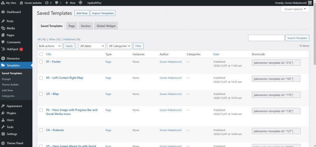
Early on, Elementor was only a page builder, and now it is both a page builder and a theme builder; you can replace almost all the elements of the theme you are using with the help of Elementor. Navigate to the control panel of your site, and under the menu option Templates, you will find saved templates, pages, sections, and global plugins, as you can see in the image below. Here, you can use already created templates, create a new one, or import an already created one.
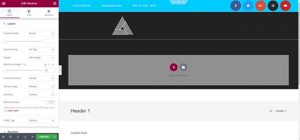
If you choose to create a new template, you will see several options to choose from. First, choose to create a header. A library of different header templates will appear, and when you see one you like, select it and click the button Insert. After that, you can adapt it to your own preferences.
Template Changes
Choose your custom appearance options and design your site’s appearance next. You can change the color of the icons, the color of the background, and information about the phone number, email, and working hours. Then, you can select and remove icons of popular social networks to make sure your business platform links are listed accurately, adjust the space between them, add space between the top and the bottom of the section, change the color of the icons or text when you move the mouse over it, add animations for when the site loads, and so on.
There are many options to help you customize your site, so just experiment and choose what you want to try and find out what is visually appealing to you. You make all these changes by clicking on a specific section and under options Style and Advanced there are possibilities to change all the things mentioned above.
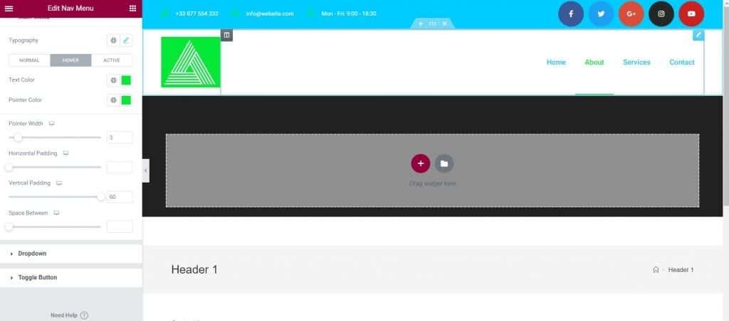
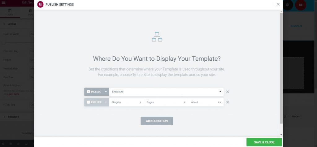
Above is an example of how the logo was changed to have a different background; you can also change your navigation menu to be horizontal, vertical, or drop-down; it can have a pointer under each menu item, and it can change color when the mouse is hovered over it. Once you have set up your template, click on Publish and then the display conditions that need to be set will appear. Decide where you want the header to be displayed. Will it be throughout the entire site, only on specific pages, or throughout the entire site but not on certain pages? Then set two conditions. Once you save the conditions, the template is placed on the site.
In order for your header to be sticky (i.e. not moving when you scroll the page), select the section, then select the option Motion Effects and at the field Sticky, set where you want the header to be. In order for the menu in the header to look nice even when you scroll the page, at the option Custom CSS, add this one line of code – selector{background: #fff}. You can choose whatever color you want for the background, here only an example of the color white is given.
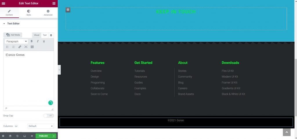
The footer of the page is created similarly; start by creating a template by selecting it on the control panel just as you did with the header. Choose the one you like from the library, adjust it to your needs, just as you did before, set the display conditions and publish it on your site.
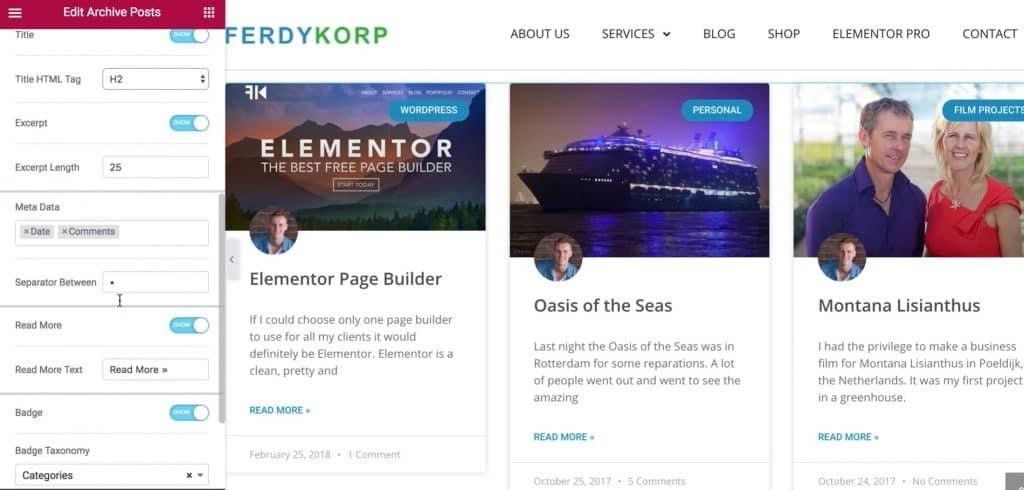
After we have created the header and footer, the next item is the blog page. We create it by selecting a new template and selecting it as template type Archive and then name it “Blog Page” or whatever you’d like. From the predesigned template library, choose the one that suits you, then adjust the way you want it to look. Some of the options include setting the number of articles in one row, the number of columns, the size of the image of the article, where it will stand above or below the short test, and so on.
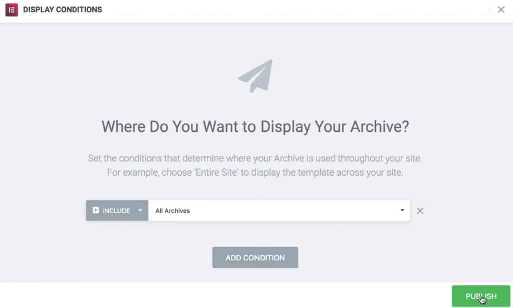
After that, set the display conditions and the blog page template is ready; all that’s left to do is to publish it.
The template is finished, and you can now add dynamic content. The title can be added to the blog page, then the description of the page and the author of the text, all above the articles on the blog page to make the page look better. Adjust the spacing and margins between dynamic content and articles so that everything looks good visually.
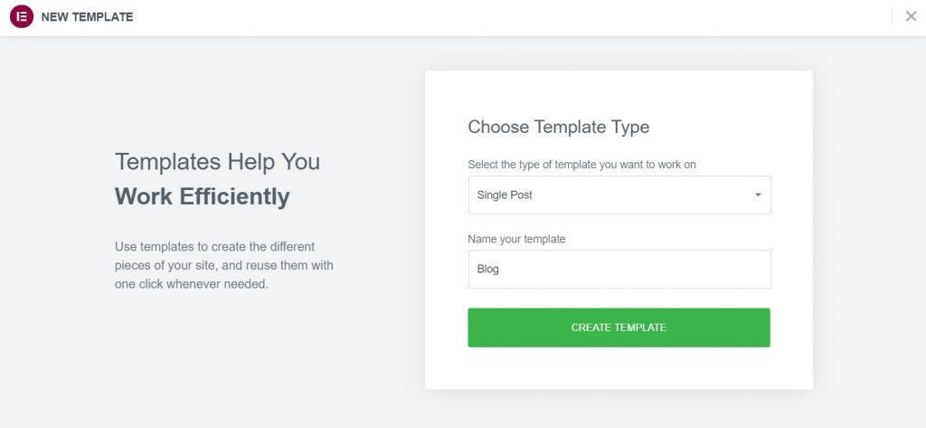
The next template you’re going to create is an article template. Start at the dashboard again in templates, and choose “create new” and choose Single Post. Name it “Blog” or whatever you’d like. As in the prior examples, choose the article template you like from the library and then adapt it to your needs.
Differences Between Free and Pro Versions
Elementor comes in both free and PRO versions; the free version surprisingly offers rich content, including everything a basic site needs. The main drawback of the free version is the lack of custom CSS editing and the inability to drag the navigation menu. You can implement a navigation menu through specific themes (like the Blocksy theme), but if you want full site customization options, the free version may not be suitable due to its limitations.
The PRO version of Elementor has additional widgets that can transform your site significantly. Besides various additional animations and options for sticky elements, creating different pop-ups, and implementing templates from Elementor’s rich database (also available for the free version but limited), PRO provides advanced features.
Depending on your needs, you can decide whether the free version is sufficient or if it is better to invest in a PRO license. If, for example, you plan to start building sites for clients with Elementor, our advice is to go for the PRO license, as it will be a worthwhile investment.
*If you haven’t signed up for WordPress yet, use our affiliate link to register and create your website today. Thank you for your support.
This post was written by the company that maintains this website. They are a marketing firm with website development enthusiasts. If you want to learn more about how Elementor can help you build your next website, watch this YouTube video. Subscribe for more business, sales, and investing posts. Have a lovely day!